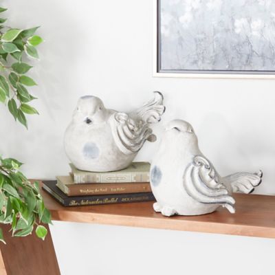
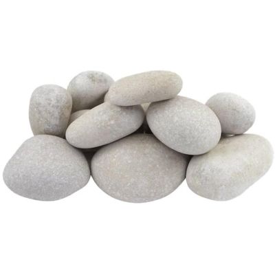
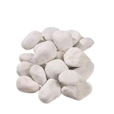
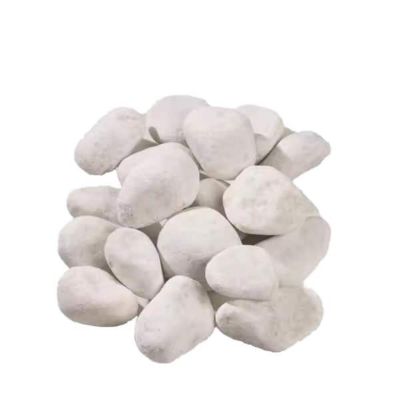
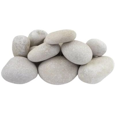
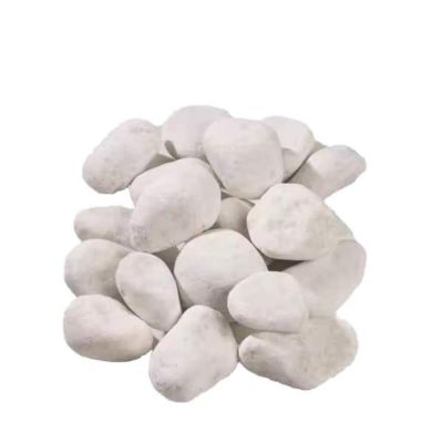
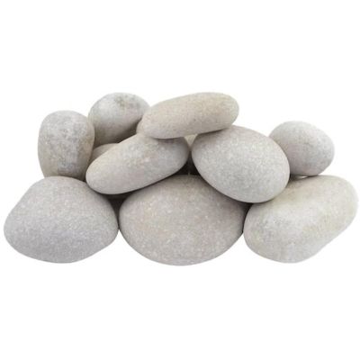
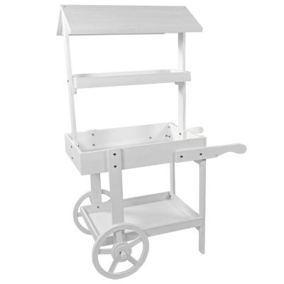
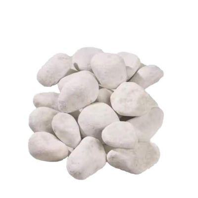
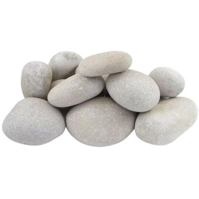
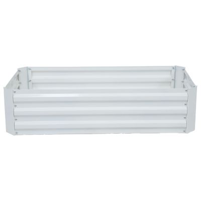
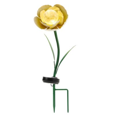
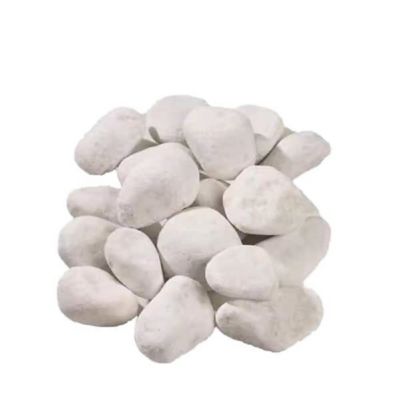
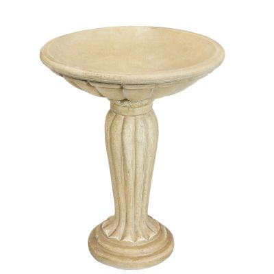
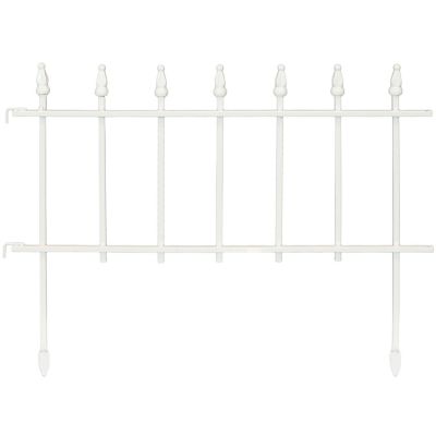
White garden accents give yards, porches, patios, and pathways a bright, calm look without taking attention away from the plants. Against deep green leaves or dark mulch, even a little white stands out. Along pale gravel or a light porch floor, it blends in more, so the shape and texture of a piece do more of the work. A crisp white finish makes a clear outline against barn-red siding, while ivory and cream sit easily alongside natural wood, brick, and tan stone. Matte finishes have a softer look, and glossy ones catch the light and show off curves and raised details. Those differences make it easy to work white into spaces that already have a mix of colors and materials. At the bend in a path, a freestanding accent can draw the eye toward a bed that’s easy to miss from the porch. On a back step where there’s already plenty going on, a small touch of white can make the doorway look pulled together without crowding the landing. A bigger yard has room to repeat the color in a few spots, like near the gate and again by the patio, so those areas feel connected even if they’re surfaced in different materials. White also leaves room for bold blooms to do their thing: orange and purple look especially vivid beside it, while pale flowers make for a softer look. For a little more color without losing that soft look,
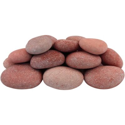
pink garden accents pair well with white, especially around muted greens and warm wood tones. Not every white finish needs to match, either. Cream and bright white look less like a mismatch when there’s a stretch of greenery or bare wood between them than when they’re side by side on the same ledge.
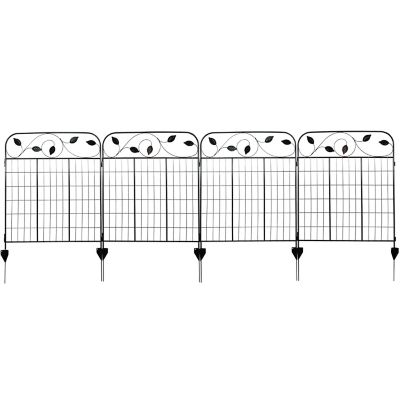
Where a piece will sit matters as much as how it looks. On a narrow porch, a shallow piece can leave room to carry groceries past it, while something broader fits where there’s more floor space and less foot traffic. Near a gate, there’s the swing of the gate to account for, plus enough clearance to roll a wheelbarrow through without clipping anything. A piece that looks substantial up close might disappear against a wide bed when seen from the house. On the other hand, a tall piece can hide the low plants right behind it, even if it doesn’t take up much ground. Base shape matters, too: a broad, flat bottom makes better contact with a firm, level surface than it does with loose gravel. Materials change how an accent looks, feels, and holds up in that spot. Cast stone has a substantial feel and can make sense for a place where the piece will stay put. Resin is often lighter, which is handy if it’ll need to move when it’s time to tend the bed or sweep the patio. Glazed ceramic offers a smooth finish that’s easy to wipe, though its edges can chip if knocked against a step or hard floor. Painted wood can still show some grain, while coated metal can give a piece a thinner, more defined outline. With either one, the finish may show wear first at the edges or where the base rubs against a rough surface. For a spot right alongside a planting bed, it helps to look for a material and finish meant for outdoor placement rather than judging by weight or thickness alone. Hanging pieces have a different kind of fit to think about: the mounting surface needs to support the weight, and there should be enough clearance that the piece doesn’t rub against siding or get in the way when a door opens.
White finishes tend to show potting soil, grass clippings, and muddy splashes more readily than darker finishes, especially near a bed that gets watered by hand. A smooth surface is usually simpler to wipe down than one with deep grooves, where a bit of grit can settle out of reach of a quick pass with a cloth. That texture can still be worth having in a spot where the piece is mostly seen from a distance; the shadows in the grooves help its shape show up against a light background. For routine care, a soft cloth can lift loose dirt without scuffing the finish, and the care directions can help sort out which cleaners are safe for coated, painted, or glazed surfaces. When it’s time to sweep or tidy up around heavier pieces, lifting instead of dragging helps spare both the base and the surface underneath. These small differences matter when picking something for another household, too. A housewarming gift for someone with a front stoop has to fit a different space than a thank-you gift for a gardener with a long path and a few beds. When the exact layout isn’t known, a piece that’s easy to move gives the recipient more leeway to find a spot for it. When the space is familiar, the colors already there are a good clue: a soft white can settle in beside an old wood railing, while a cleaner white can pick up the color of painted trim. A person who spends more time sitting on the porch than working in the beds may appreciate a piece with details that are easy to see from a chair. For someone who tends a big yard, a simple shape that reads clearly from across the grass may be a better fit. It comes down to where the piece will be seen and how that part of the yard gets lived in, whether it’s the everyday route to the side door or a quiet corner people stop to enjoy.