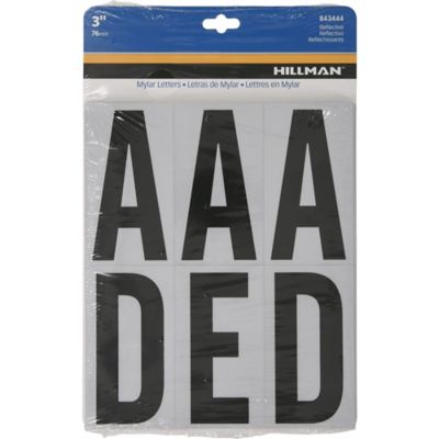
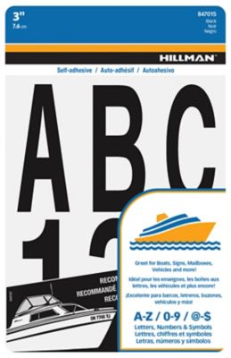
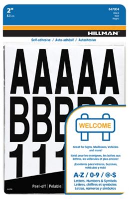
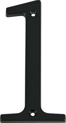
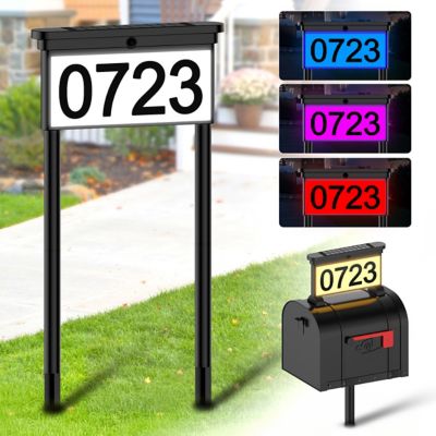
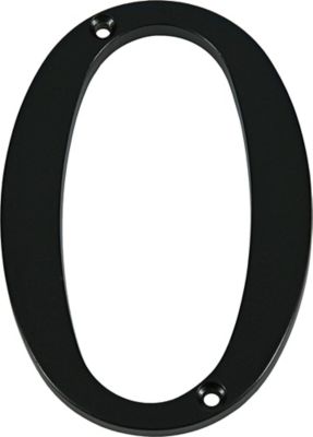
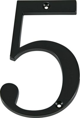
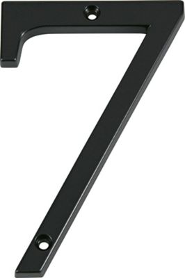
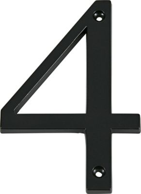
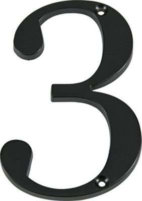
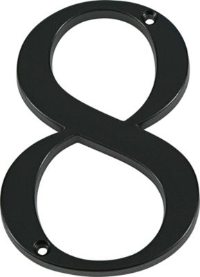
Reflective numbers for mailboxes help make an address easier to pick out when headlights or another light source reaches the mailbox. At the end of a long gravel lane, beside a busy county road, or in a row of neighboring boxes, readable numbers give mail carriers, delivery drivers, visitors, and emergency responders another way to identify the right property. Reflective material sends incoming light back toward its source; it does not create light on its own. That distinction matters on an unlit stretch of road, where ordinary lettering may blend into the mailbox until a driver gets close. Standard reflective numbers need no wiring or batteries, making them a straightforward option for marking a roadside box or an address panel attached to its post. Visibility still depends on the size of the characters, their contrast against the background, their placement, and the angle of the approaching light. Larger digits with open shapes and clear spacing generally offer a better chance of being read from a moving vehicle than small, tightly packed lettering. For curbside mailboxes, USPS guidance calls for address numbers at least 1 inch high in a contrasting color, with placement determined by the carrier’s approach and whether mailboxes are grouped. That minimum is a starting point rather than a promise of easy reading at every distance. Numbers in the 2-inch to 4-inch range can provide a more noticeable address when the mailbox has enough room, while local address-display rules may call for a particular size or a separate roadside marker. A short address on a broad mailbox side leaves plenty of space for larger characters. A longer address on a narrow box takes more planning so each digit remains distinct. The goal is a number that can be recognized without a visitor having to stop beside every driveway and hunt for the right turn. Reflective mailbox numbers can support that goal, but they do not replace any separately required emergency-address sign.
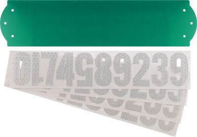
Material and format affect both the finished appearance and how well mailbox numbers fit their mounting surface. Flexible adhesive-backed vinyl can sit close to a smooth mailbox wall without projecting hardware, while reflective film on a rigid plate provides a separate address surface where the mailbox itself offers little usable space. Some designs have reflective characters; others place dark characters against a reflective background. Those constructions can look similar in daylight but respond differently when light reaches them, so the material description matters more than color alone. White or silver reflective numerals can provide strong contrast on
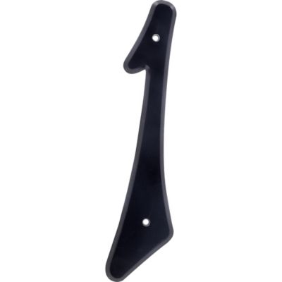
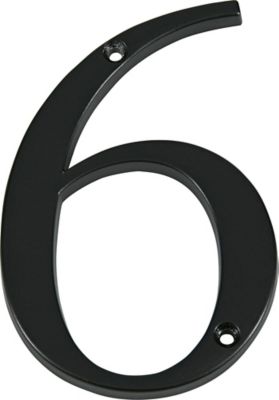
Black Mailboxes, while a light-colored box may need dark characters on a reflective panel to keep the address distinct. A dark number is not necessarily reflective simply because it stands out during the day. Individual digits allow flexible spacing, which helps when an address must fit between a seam and the flag bracket. A connected strip or number panel keeps the layout together, though its full width needs to match the space on the mailbox. The height listed for a character does not describe the width of the completed address: four broad digits, spaces between them, and clear margins can take up considerably more room than expected. Curved mailbox tops, ribs, raised lettering, and recessed sections also affect contact and readability. A flat section usually gives adhesive numbers the most consistent contact, while a sharply curved area can pull the edges away from the surface. For screw-mounted plates or rigid characters, the mounting pattern and clearance behind the surface matter too. Nothing should interfere with the door, latch, mail opening, or flag movement. Plain block-style numerals are often the most practical fit for a working farm entrance or roadside mailbox because their shapes remain easy to tell apart. A clearly formed 6, 8, or 9 matters more than fancy lettering when someone is reading an address from the road.
Long-term performance comes down to the reflective layer, the backing, the mounting surface, and routine care. Materials labeled for outdoor applications are better suited to mailbox placement than lettering intended only for indoor signs. Resistance to ultraviolet light helps limit fading from sunlight, while moisture resistance helps protect the number face and adhesive bond. These features vary by construction, and a reflective face does not automatically mean every backing or adhesive suits every mailbox material. Painted steel, aluminum, and molded plastic can have different surface textures and coating requirements. A smooth, sound finish gives adhesive lettering a better foundation than flaking paint, rust, grease, or a chalky surface. Manufacturer directions should identify compatible surfaces, preparation needs, and any waiting period before cleaning or handling the applied numbers. Strong solvents and abrasive pads can damage reflective coatings, so gentle cleaning with a soft cloth and a compatible mild cleaner is generally the better approach. Road grime and dust can cover the reflective face even when the number remains firmly attached; keeping that face clean helps it do its job. Lifted corners, missing pieces, and worn sections deserve attention because a partly covered or damaged digit can change the address someone reads. Placement deserves the same care as the material. A number on the door may be clear to someone stopped directly in front of the box but hard to see from either direction along the road. Side-facing numbers or an approved post-mounted address panel can provide a better view, depending on the mailbox arrangement and local requirements. At shared mailbox locations, each address needs a clear connection to its own box rather than appearing to belong to the whole row. For households with frequent deliveries, farm entrances with more than one drive, or relatives who visit after dark, a readable reflective address is a small detail with an everyday purpose. Enough character height, sensible spacing, a suitable mounting surface, and an unobstructed view all help the right number stand out.