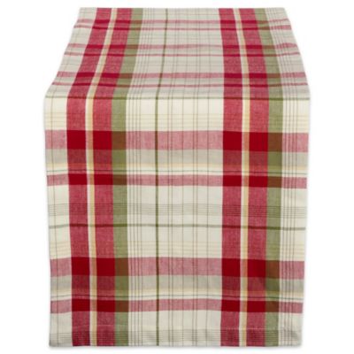
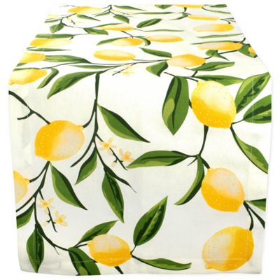
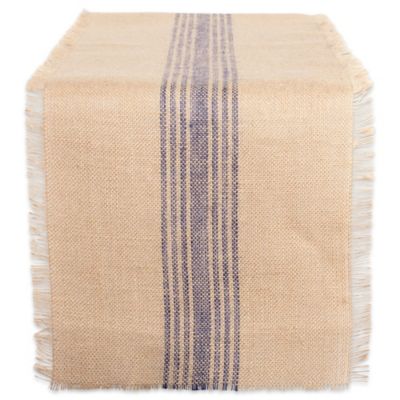
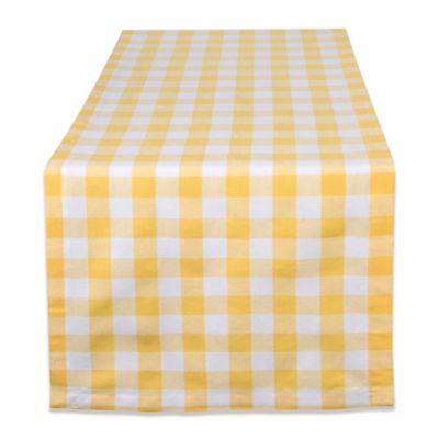
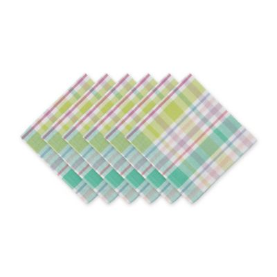
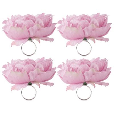
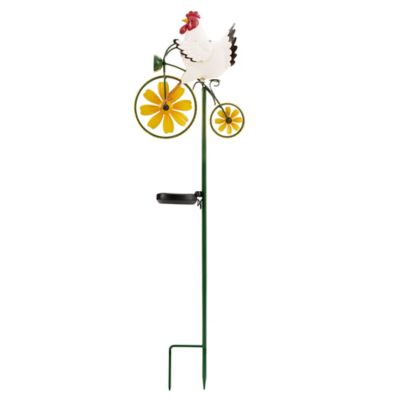
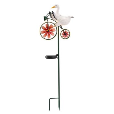
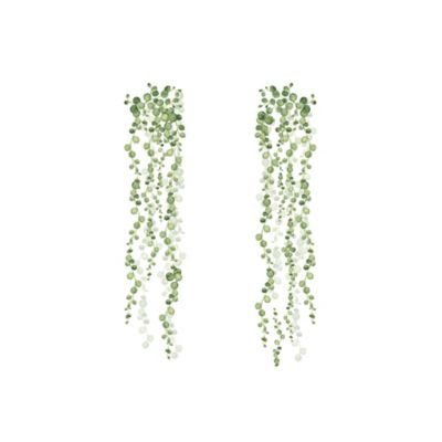
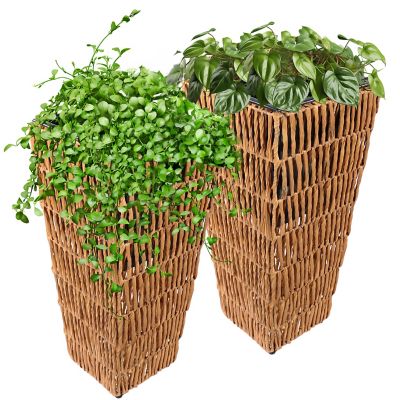
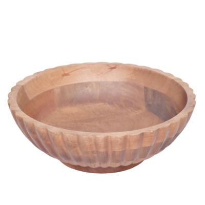
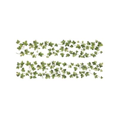
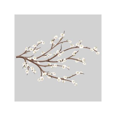
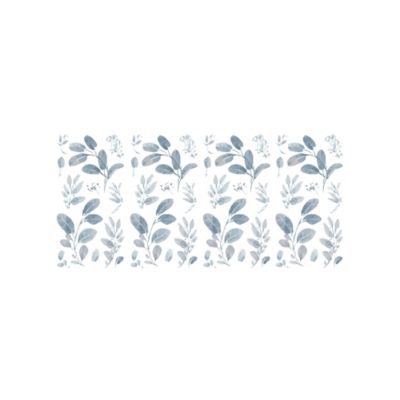
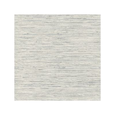
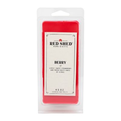
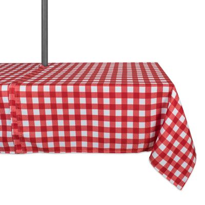
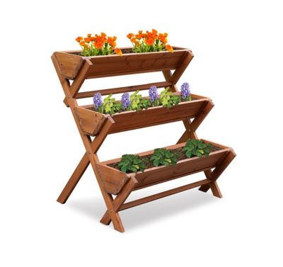
Spring home accents bring the look of garden blooms, fresh greenery, and open country into everyday rooms through soft colors, floral patterns, and natural textures. Pale yellow, blush pink, sky blue, and leafy green are familiar choices, but the season’s look can be just as welcoming in cream, warm brown, and muted earth tones. These shades sit comfortably alongside wood furniture, painted cabinets, stone hearths, and the practical finishes found in a busy farmhouse. Botanical prints, woven surfaces, and small touches of glass or ceramic add interest without making a room feel crowded. A kitchen where everyone gathers for coffee might suit a few cheerful details, while a front entry can carry a stronger mix of color and texture. Floral accents work especially well when their scale matches the space: larger blooms stand out across a room, while smaller patterns reward a closer look at a breakfast nook or bedside surface. Artificial greenery offers a lasting botanical look without watering, though its suitability for sunlight or outdoor placement depends on the material and care label. Natural fibers bring an earthy feel, smooth glazed surfaces catch the light, and brushed metal provides contrast against soft fabrics. Spring accents can lean toward garden-inspired simplicity, farmhouse character, or a playful Easter setting with rabbit, bird, and egg motifs. General floral and botanical themes can stay in place beyond a holiday gathering, while occasion-specific details give a room a more focused look for the celebration. A repeated color helps connect these different elements, whether it appears near the front door, across the dining area, or beside a favorite chair. There is no need for every finish to match; a little variation often feels more at home beside well-loved furniture. The result can feel cheerful and settled rather than overly arranged, with enough breathing room for the people, pets, and daily routines that make a house a home.
Materials, dimensions, and intended placement matter just as much as color when choosing spring furnishings. Cotton and linen fabrics tend to have a relaxed appearance, while some synthetic blends offer different care requirements or better resistance to wrinkling; the fiber label is the best place to confirm what a piece needs. Removable, machine-washable fabric covers can make sense in a family room where muddy paws and snack spills are part of the day, provided the washing instructions allow it. Textured weaves add depth to a plain chair or bench, though loose loops and fringe may catch on claws. Wood brings warmth and visible grain, but its finish determines how it handles moisture and routine wiping. Ceramic and glass provide smooth surfaces and a clean, bright look, with the trade-off that they can chip or break if knocked from a busy tabletop. Metal finishes range from smooth and painted to weathered-looking, and outdoor suitability should never be assumed from appearance alone. An indoor accent belongs indoors unless its labeling says otherwise; even a covered porch can expose furnishings to windblown rain, damp air, and direct sun. Fade resistance, corrosion resistance, and a secure base are useful considerations for pieces intended for those settings. Fit also includes the room around an accent. A dining arrangement needs to leave space for serving dishes and conversation across the table, while an entryway should stay clear enough for boots, bags, and a door that swings all the way open. On a narrow mantel or shelf, depth and stability matter more than an appealing photo suggests. Hanging accents need hardware suited to their weight and the mounting surface, with placement that will not interfere with handles or glass panels. Care is generally simplest when it follows the manufacturer’s directions: gentle dusting may suit one finish, while another permits a damp cloth. Harsh cleaners, soaking, and long stretches in direct sunlight can affect fabrics, coatings, or adhesives differently, so material-specific instructions help protect the appearance over time.
Spring accents suit everything from a quiet kitchen refresh to a family meal with a table full of cousins. For everyday spaces, a restrained mix often feels right: soft botanical color near the window, a little woven texture beside sturdy furniture, and enough open surface for a coffee cup or the day’s mail. Gathering spaces can carry more detail, but comfort still comes first. Low-profile arrangements keep faces visible across a table, and fabrics that lie flat are less likely to snag serving dishes or catch on a passing sleeve. In homes with young children or curious animals, placement matters. Small loose parts, trailing cords, and breakable materials are better kept beyond easy reach, while artificial plants should stay out of reach of pets that chew. Fresh flowers and living greenery call for a separate check of plant safety around animals. For porches and entrances, spring styling feels most natural when it respects the way the space works, leaving walking paths clear and allowing room to set down groceries or pull off work boots. Coordinating colors can carry that welcoming feel inside without repeating the same pattern in every room. Related
Spring Accessories can help tie together a broader seasonal look, especially when a shared shade or texture connects the different spaces. These accents can also make thoughtful housewarming, host, or Easter gifts for someone who enjoys tending a garden or keeping a welcoming home. Familiar colors, manageable dimensions, and straightforward care are worth considering when choosing for another household. Pieces with a broad botanical theme offer flexibility for different rooms and occasions, while more playful motifs suit someone who enjoys marking the holiday. Storage deserves a little thought, too: clean, fully dry fabrics and protected breakable surfaces are easier to bring back out looking their best. Taken together, sensible materials, a comfortable scale, and a few garden-inspired touches give spring furnishings their staying power in a home built around real daily life.