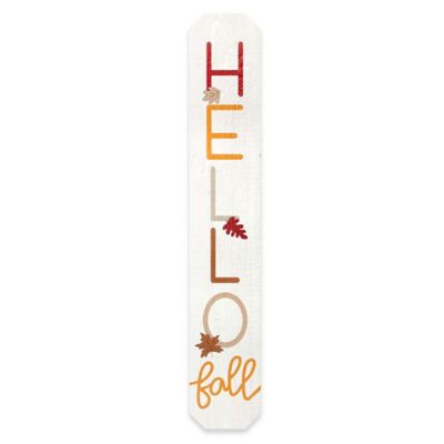
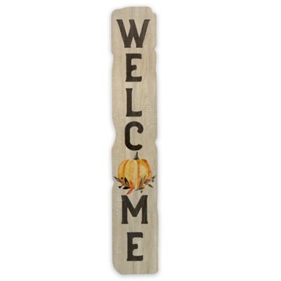
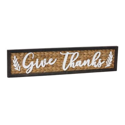
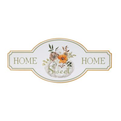
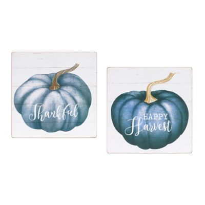
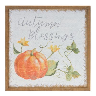
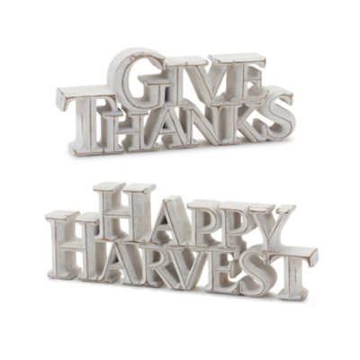
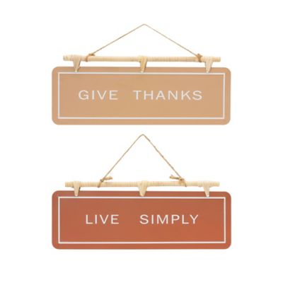
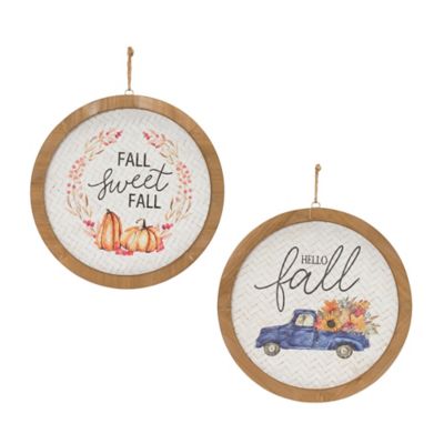
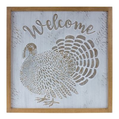
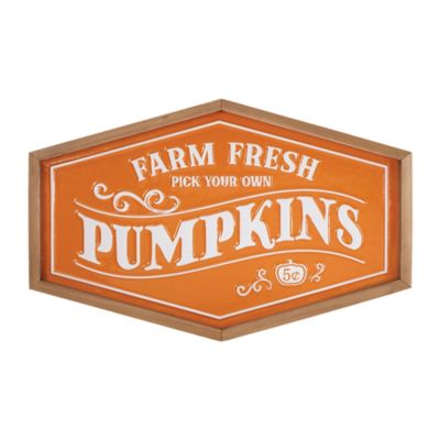
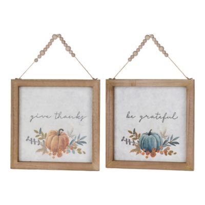
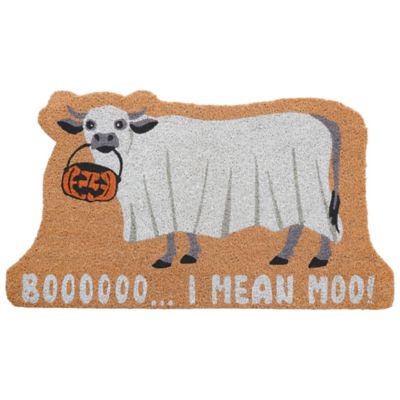
Fall signs are seasonal accents that bring autumn harvest themes, friendly greetings, and a little country character to homes, porches, yards, and gathering places. Pumpkins, colorful leaves, sunflowers, corn stalks, and harvest lettering are common features, with colors ranging from barn red and burnt orange to cream, brown, and muted green. Some designs celebrate the whole autumn season, while others center on Halloween or Thanksgiving. That distinction matters when choosing a sign for a front entry, a farmstand counter, or a dining room where family gathers for a harvest meal. A simple pumpkin scene fits a broad stretch of fall occasions; ghosts and jack-o’-lanterns create a more Halloween-focused display, while messages of gratitude suit Thanksgiving gatherings. The main formats include tall porch leaners, hanging door signs, freestanding tabletop signs, and lawn signs with stakes. Each fills a different space without calling for a complete change to the rest of the room or entryway. A vertical sign adds height beside a door, a round hanger draws attention at eye level, and a small block sign gives a shelf or sideboard a seasonal touch. For entrances where the greeting is the main attraction,
fall welcome signs offer a natural focus for a welcoming autumn display. Lettering plays a big part in the overall look, too. Broad, straightforward letters tend to read well from a walkway, while smaller script is better suited to spots where folks can pause and take a closer look. A cream background with dark lettering can stand out against brick or stained siding, while warm orange and brown tones feel right at home alongside hay bales and baskets. The best match comes down to where the sign will sit, how far away people will see it, and whether the message should feel playful, neighborly, or centered on the harvest. A clear design often makes a stronger impression than one crowded with lettering and artwork, especially beside an entry that already has plenty going on.
Materials and construction affect both the appearance of fall signs and the places they can go. Wood brings visible grain and a familiar farmhouse feel, while engineered wood offers a smooth surface for printed artwork and lettering. Neither material should be assumed suitable for open-air placement simply because it looks rustic. Edges, backs, and attachment points can be vulnerable to moisture, and an indoor sign may swell or lose its finish if rain reaches it. Metal offers a different look, from flat painted shapes to embossed surfaces, but its finish and care requirements still matter; scratches can expose some metals to corrosion. Plastic and PVC designs may suit outdoor settings when labeled for that purpose, though resistance to sunlight, moisture, and temperature changes varies by construction. The product’s stated indoor or outdoor use is more useful than appearance alone when deciding between a kitchen shelf, a covered porch, and an open yard. A roof overhead helps limit direct rainfall, but windblown rain and sunlight can still reach a porch display. Size deserves the same attention as material. A tall porch leaner needs enough floor space to sit securely without narrowing the path for boots, grocery bags, or a dog coming through the doorway. Hanging signs need suitable attachment points and enough clearance for the door to open and close freely. On a storm door, even a modestly raised bow or frame can interfere with the space between doors. Tabletop signs work best when their base supports their height and weight, particularly on a narrow mantel or a busy serving table. Yard stakes need ground that allows proper insertion and a location away from foot traffic, mowing paths, and underground utilities. For every format, weight, mounting hardware, and the supporting surface belong in the same decision. A lightweight door hanger and a substantial wooden leaner have very different support needs, even when they carry the same friendly fall message.
Fall signs fit naturally into the places where everyday country life and seasonal gatherings meet. Near the mudroom, a small harvest sign can brighten the spot where work gloves and chore boots land. On a front porch, a taller design can balance a low arrangement of pumpkins without taking over the whole entry. At a farmstand or roadside market, readable autumn lettering can help establish a harvest setting, provided the display stays separate from traffic signs and leaves entrances clear. Indoors, compact signs can sit among serving pieces on a sideboard or anchor an arrangement on a fireplace mantel, safely away from heat and open flames. Homes with children or pets benefit from placement that keeps pointed stakes, dangling cords, and easily tipped pieces out of reach. A sign can also make a thoughtful host or housewarming gift for someone who enjoys welcoming friends over in the fall. A general harvest image or simple greeting is often easier to fit into another person’s home than a large piece with a very specific message, and a smaller format asks less of their wall or storage space. Keeping signs looking their best usually starts with gentle care rather than heavy scrubbing. A soft, dry cloth is often enough for indoor dust; outdoor pieces may need a damp wipe if their care instructions allow it. Soaking, abrasive pads, and strong cleaners can harm painted details, printed surfaces, or protective finishes. Before storage, signs should be clean and fully dry, with hooks and fasteners checked for looseness. Smooth, nonabrasive wrapping helps prevent scuffs, while a dry storage spot protects wood-based pieces from dampness. Heavy objects should not rest on raised lettering, thin metal shapes, or attached accents. With the right placement and care, a fall sign can become a familiar part of family gatherings, porch visits, and harvest celebrations year after year. Whether the setting is a farmhouse kitchen, a small-town storefront, or a front step with room for just one pumpkin, the appeal is the same: a friendly touch that makes the place feel ready for company.